
Verizon
Scaling and maintaining Verizon’s design system.
An overview of my work and responsibilities around Design System work across mobile, tablet, desktop and TV.
Jump to…
1
2
Design system initiatives (mini case-studies)
3
4
5
6
7
Overview
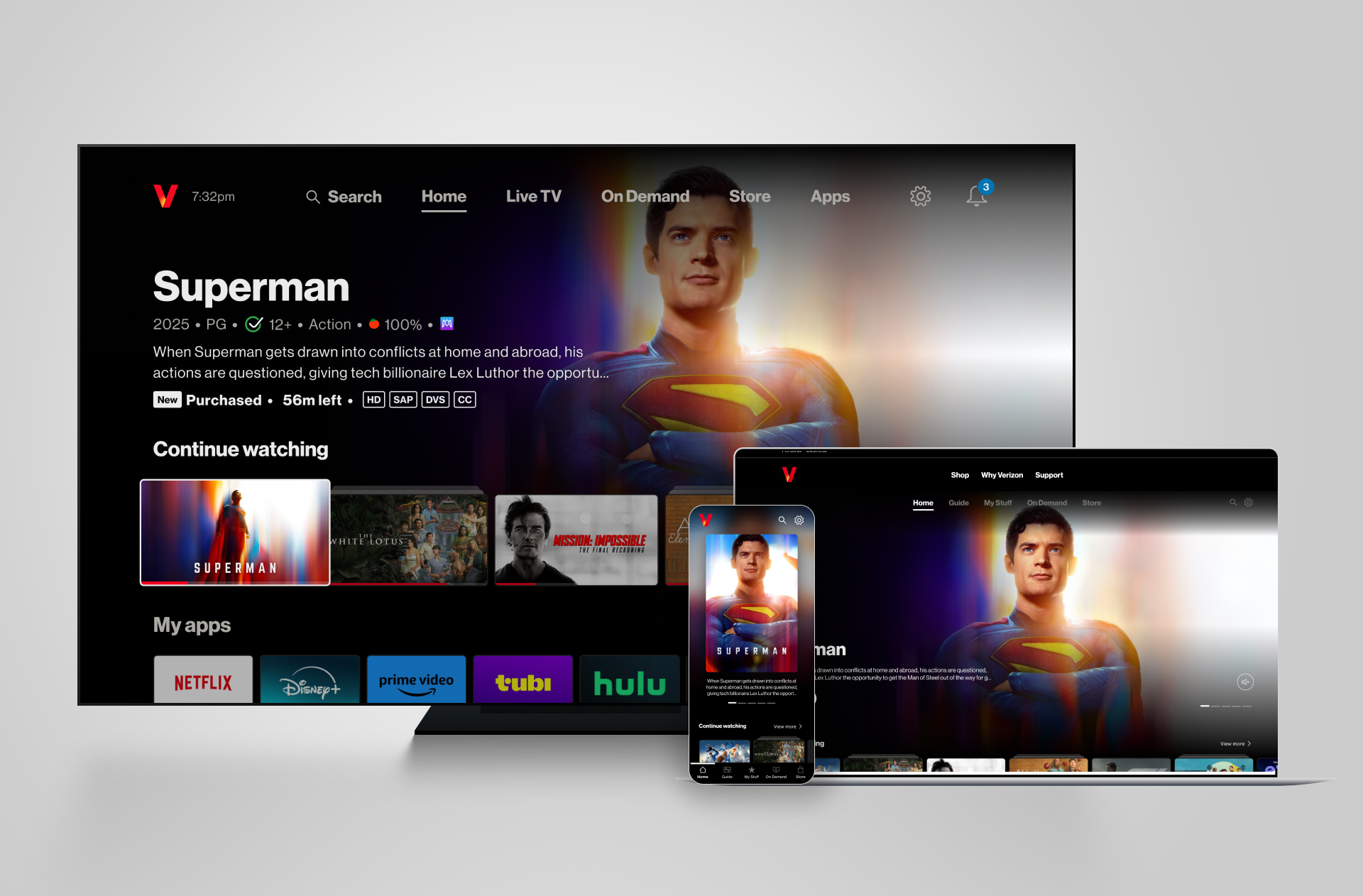
Verizon is one of the largest telecommunications companies in the world. One of their digital products is Fios TV, a streaming platform comparable to Sky in the UK.
Customers access Fios TV through a set-top box connected to their TV, giving them access to live TV, streaming apps, on-demand content, and a content store.
As an agency, we were responsible for the design system supporting Verizon’s TV streaming products, including two set-top box experiences, tvOS and Fire TV apps and a mobile app and website.
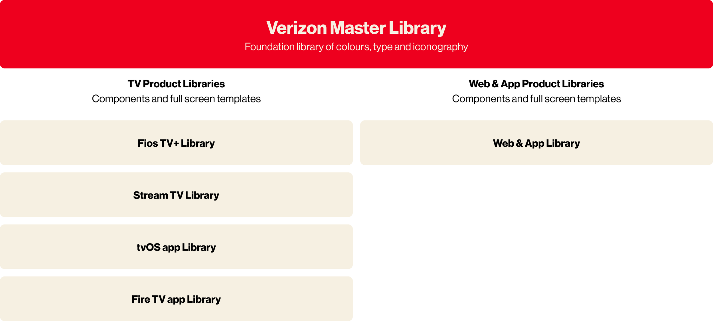
We used the Verizon Design System (VDS) — the core system used across Verizon’s telecom products — as the foundation for colour, type, and base component styling. This provided strong brand alignment, while still requiring us to design new, TV-specific components and interaction patterns that did not exist in the core system.
Over the past four years as part of my role as Product Designer, I’ve been responsible for the end-to-end ownership, maintenance, and evolution of all design libraries for Verizon’s streaming products and the master library of foundations. I partnered closely with product designers, engineers, and brand teams to ensure the system could support current and future TV experiences.
5 separate TV products, a mobile app and website all actively used these libraries daily across a design team split across London and New York which meant they needed to be maintained and evolved constantly with great detail and alignment.
My role
My role grew significantly over time, and I am now the primary point of contact for all design system updates, maintenance, and decision-making. I lead system updates, manage governance, and ensure the system remains scalable, inclusive, and future-ready.
Summary of responsibilities
Central ownership of a cross-product streaming design system
Collaboration with product design, engineering, and brand partners
Governance and long-term maintenance of component libraries
Leadership of multiple modernisation and rebrand initiatives
Continuous evolution toward automation, tokens, and scalability
Primary POC for all library updates and system-level decisions
Responsibilities
How I govern Verizons design system
An overview of how our design system runs. It’s always evolving as we learn, but have rules and guidance in place to ensure we are creating and maintaining the libraries to the highest standards.
Overview
-
Accessibility is an essential requirement across all platforms and application of accessibility must reflect how users actually interact with the product. For TV experiences, this means designing for the 10-foot viewing distance, varying screen quality, and remote based navigation. I prioritise high contrast colour usage, clear and persistent focus states, and predictable directional navigation to ensure the interface remains legible, navigable, and usable in real living room environments.
-
A design system is only effective if it can be reliably built and maintained. Alignment with development is a non-negotiable, validating component behaviour, token structures, and interaction patterns before changes are rolled out. We want Figma to match what a developer sees. This collaboration ensures the system is feasible to implement, consistent across platforms, and scalable over time, reducing work and maintaining trust in the system as a single source of truth not only for designers, but developers too.
-
When adding to our libraries, we follow a strict process to ensure that as soon as designs are approved, they are reflected within Figma:
Review and approve: Design update approved by client and development team
Specs: Create any specs or documentation needed for hand over
Create a branch of the library: Name accordingly so others know what the update involves. This also helps track the task.
Build your component: Previously done soley by me, now done by the respective designer. If you pitched it, you build it. I did this so everyone on the team was able to get design system exposure.
Review and publish: Send the update to me for review, once approved, publish and update the team channel.
-
When adding to the library, designs are always critiqued internally and we often decide as a team what the best route is - new component or a variant? But as a quick guide - i created a decision flow:
Purpose: Is there an existing component that has a similar purpose?
No > New component
Yes > Next question
Layout + interaction: Does it behave the same way as an existing component or have the same atoms?
No > New component
Yes> Next question
Overall design: Does it, as a whole, have a similar visual pattern as an existing component?
No > New component
Yes > Variant
-
Whether it’s me or another designer on the team creating a component or variant, we have a checklist to ensure we build it correctly:
It is aligned with any similar VDS component?
Have you added auto-layout
Are the component, layers, properties and variants named accordingly?
Have you ensure any boolean properties have been added?
As Verizon’s streaming platform matured, the design system faced several challenges:
TV components were not flexible enough to support new content formats
Component libraries were fragmented across products
Brand updates from VDS needed to be reflected consistently on TV
Existing patterns limited hierarchy and scalability across large screens
The goal was to evolve the system into a single, flexible foundation that could:
Scale with industry changes in streaming and TV UI,
support multiple platforms without divergence, and
enable faster, more consistent design and development.
Some of the challenges we’ve faced
and how I tackled them…
Major Component Styling Overhaul
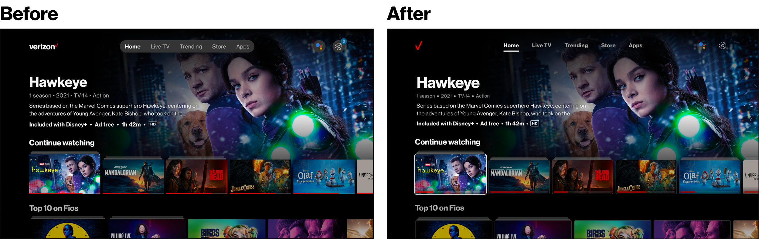
One of my first major contributions was leading the implementation of a new brand identity across the streaming products. This work took direction from the core design system (VDS) and applied it to a TV, mobile and web, requiring updates to colour, typography, and general component styling.
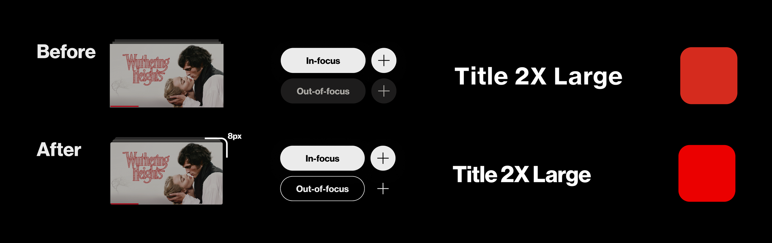
My focus was the implementation of these changes on TV as this platform hadn’t been considered by the brand team. I had to consider unique accessibility issues because of the nature of the device being 10-feet away. This also meant that focus states had to remain clear and consistent as users relied on d-pad navigation.
Developer specs for styling changes on a calendar component for mobile and web
(before dev-mode!)
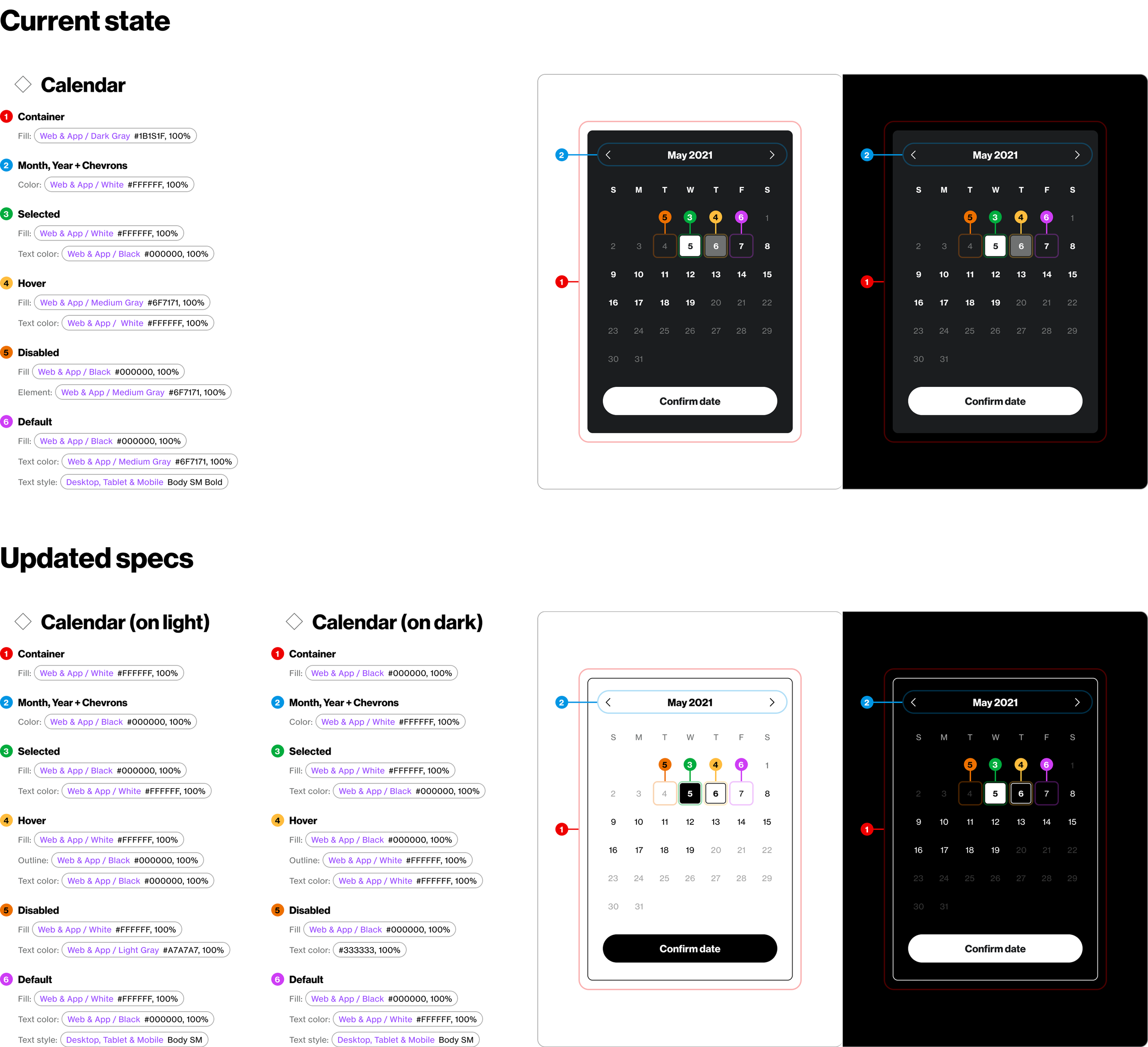
Global changes
Color palette
Verizon’s core red and secondary colours were brightened to create a more vibrant brand presence on TV. Accessibility was improved by ensuring colours performed well on digital displays, particularly in dark environments common to TV viewing.
Call-to-actions
CTA naming conventions were aligned with VDS. Button styling was updated to match web and app experiences, removing greyed-out, low-contrast focus states and icons.
Type
A revised type scale was developed as part of the wider VDS system. Tighter line height and letter spacing created a more distinctive Verizon look while improving legibility at distance.
Content cards
Rounded corners were introduced across components to modernise the UI. Focus states were redesigned with bold white outlines to ensure strong contrast against dark backgrounds and clear navigation feedback.
Designing the future TV design system
Early in my time on the project, I helped lead an initiative to envision how the design system could scale for future TV interfaces, aligning structure and principles with Verizon’s global design direction.
The objective was to begin building the next-generation TV design system - using existing component needs as a baseline, fully aligned with VDS and flexible enough to adapt quickly to changes in the streaming industry.
A major focus was enabling content layouts that could respond to changing industry standards without requiring a full redesign.
Content cards that will flex for the future
For the TV experience, content cards are the core building blocks of the UI. They define rails, hierarchy, and how users navigate content.
Previously, the system was restricted to 16:9 cards in 2 fixed sizes. This limited our ability to introduce new content types or adjust hierarchy as the platform evolved.
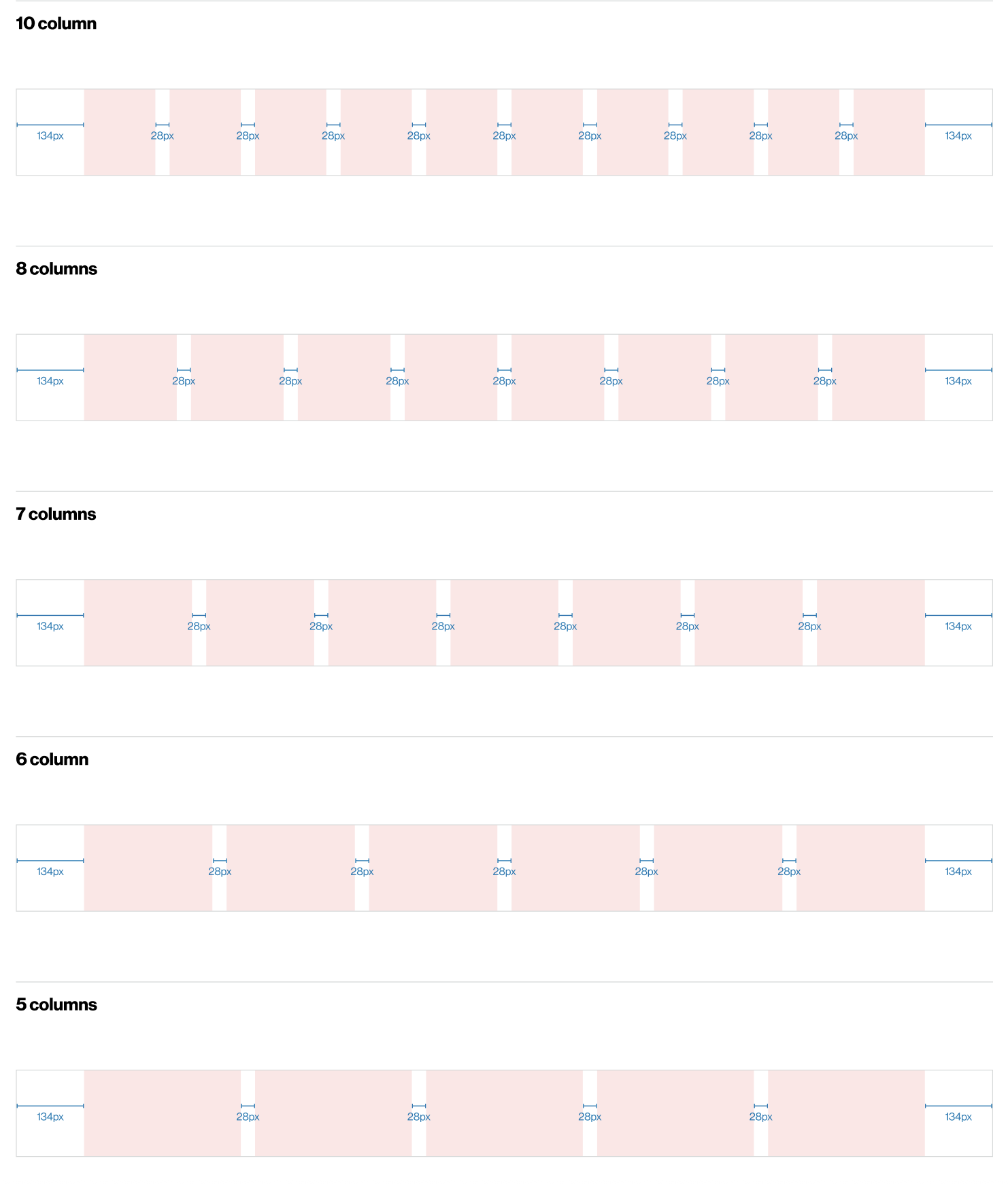
I led the exploration and design of a more flexible system by mapping column grids across the TV layout, Testing which ratios and sizes could work within existing margins and gutters and defining card variations that could scale without breaking alignment.
We expanded the system from 2 card sizes to 6, supporting: 16:9. 1:1 (square), 2:3 (portrait) and 4:3. These variations were designed to work across multiple rail types and layouts.
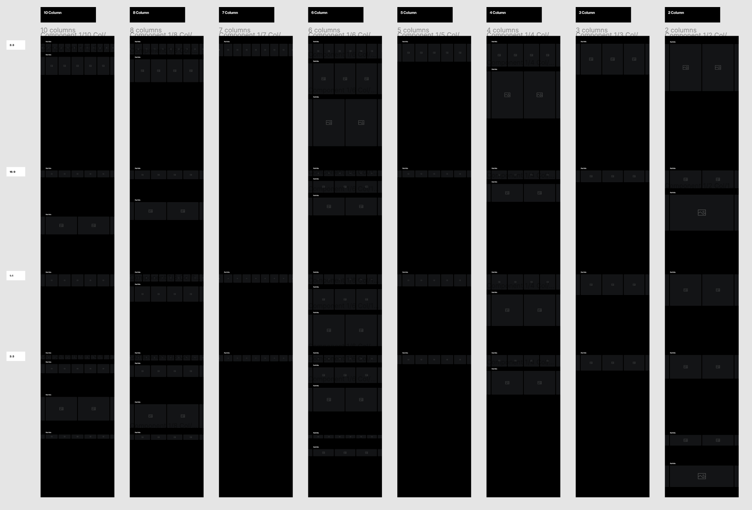
The system now supports:
Small 16:9 cards for apps
Large cards for live content
Portrait cards for “Top 10” rails
4:3 cards for shortcut rails
This flexibility allowed the product to keep pace with industry best practices, improve visual hierarchy, and respond directly to both client and user feedback.
Hand-off to the development team has been extremely smooth due to us already having built out variations of cards in many ratios and sizes. We also restrained the layer structure and naming so it was easy to adjust what was built front-end to our new sizes.
Outcome
Merging design libraries to reduce fragmentation
To reduce design debt and streamline workflows, I proposed and led the merger of two major design libraries into a single unified system.
This was a significant change to our Figma workflow, affecting designers, client stakeholders and developers who regularly referenced the libraries
I began with a full component audit:
Identifying shared components,
Defining which needed to remain product-specific
Documenting the rationale clearly for the client.
This made the decision-making process transparent and built confidence in the change.
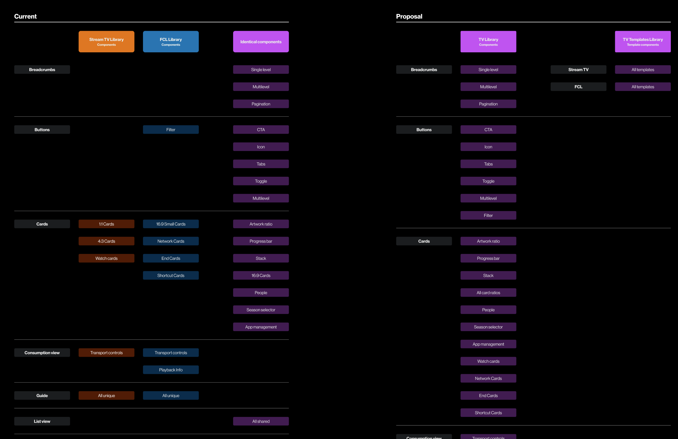
Given the scale of the change, I framed the proposal around alignment and long-term efficiency:
Encouraging cross-platform design decisions,
Enabling shared solutions where possible
Reflecting those decisions in a single source of truth.
I managed the merge across the design team by distributing work clearly, creating instruction documentation and tracking progress to ensure consistency.
Proposal and execution
The merged library has now been in use for several years and has become a strong enforcer of cross-platform alignment. Product teams are now required to align on design changes, significantly improving consistency across the ecosystem.
Outcome
Rebuilding the Web & App library from the ground, up
When I began overseeing the Web & App library, it was clear it required a full rebuild. Components were outdated, poorly structured, and difficult to use, which made even simple flows inefficient.
I led a four-phase rebuild with a junior designer:
Update colour and typography styles to variables
Rebuild all components with proper naming, auto-layout, and boolean properties
Rebuild core page templates using the new components
Rebuild all design and epic files using a clear, consistent layout structure
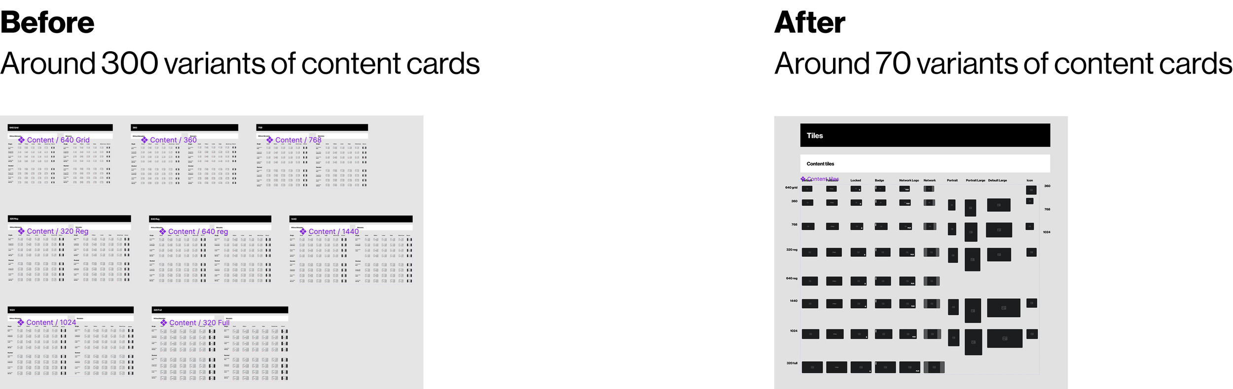
This work dramatically reduced complexity. For example, card components were reduced from 300+ variants to around 70, while improving flexibility.
The result was:
Stronger visual consistency
Well-organised flows across breakpoints and devices
Improved usability for both designers and client stakeholders
The client and development teams responded positively, noting how much easier it was to navigate and understand designs.
Outcome & impact
Outcomes & impact over the years
Improved alignment across TV, web, and mobile product teams
Reduced design debt through unified libraries and tokens
Consistent, scalable components that support evolving TV UI patterns
Reliable, organised design handoff that consistently met brand deadlines
I am now the subject-matter expert for all design system changes, processes, and decisions. Designers, product owners, and engineers rely on me for guidance on brand compliance, colour and typography usage, and component behaviour.