
Verizon
Implementing variables for Verizons cross-platform product
Implementing variables across mobile, tablet, desktop and TV
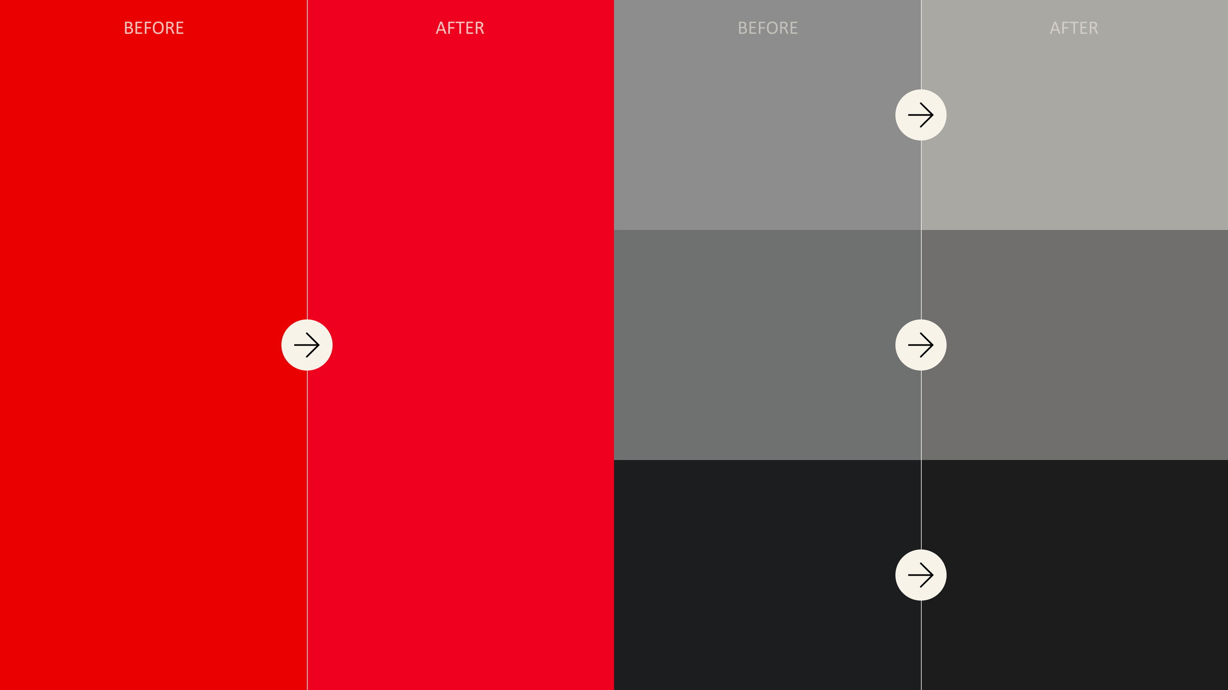
Verizon introduced new colors as part of a new brand initiative called Brand 4.0.
This included a new logo and updates to existing colors like our brand red and grays as well as 2 new colors - neon yellow and stone.
The task was to Implement the new brand across all products using variable tokens.
The challenge
After lots of discussion and proposals around introducing the two new colors, we decided with the client that for now, we would update our exiting red and grays to the new values and keep the two new colors, neon yellow and stone as brand expression colors that we could us in assets rather than UI.
Next steps:
As we are updating colors, this is the right time to introduce variables and set up tokens for color, type and radius across the platform.
The plan
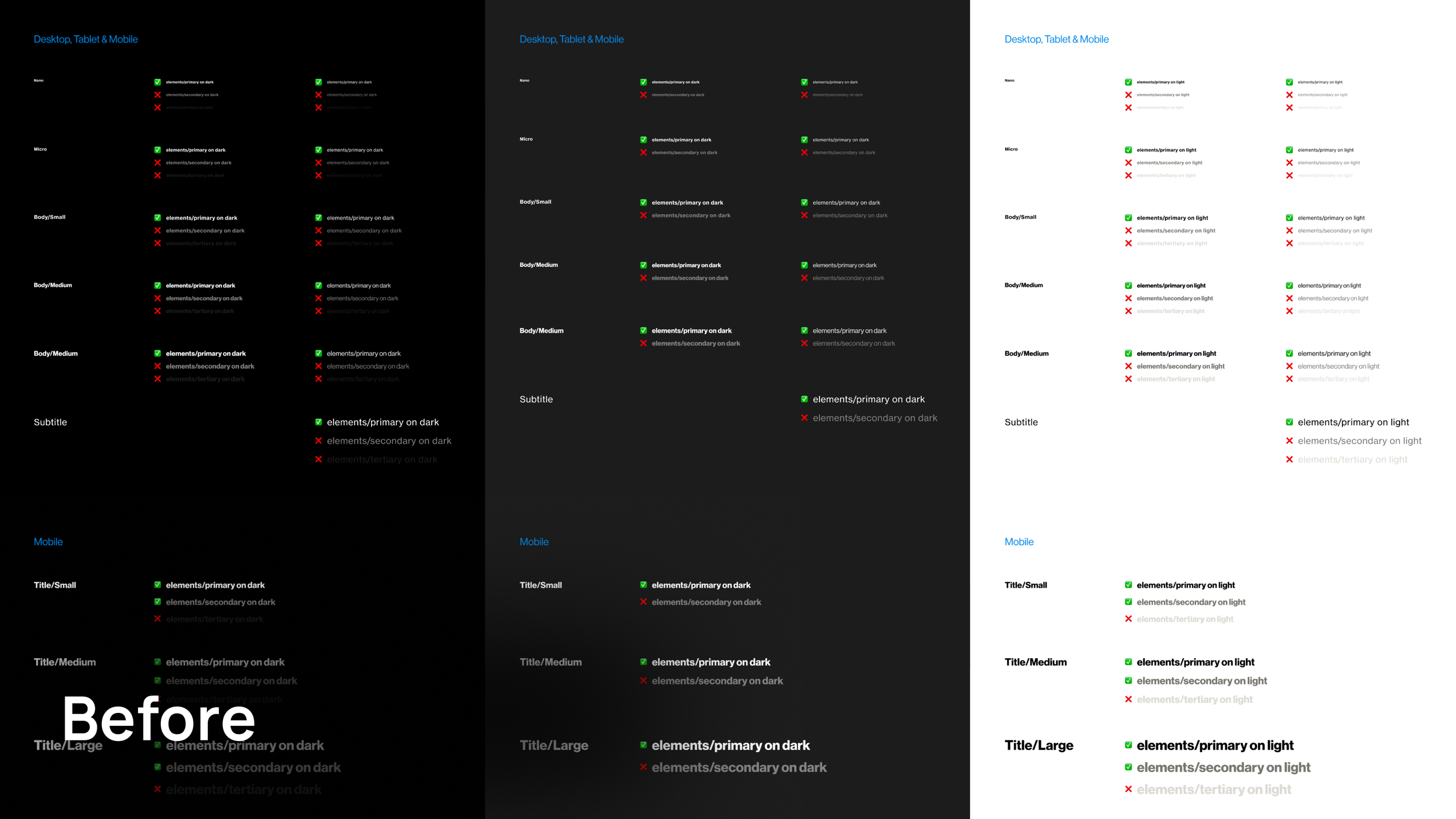
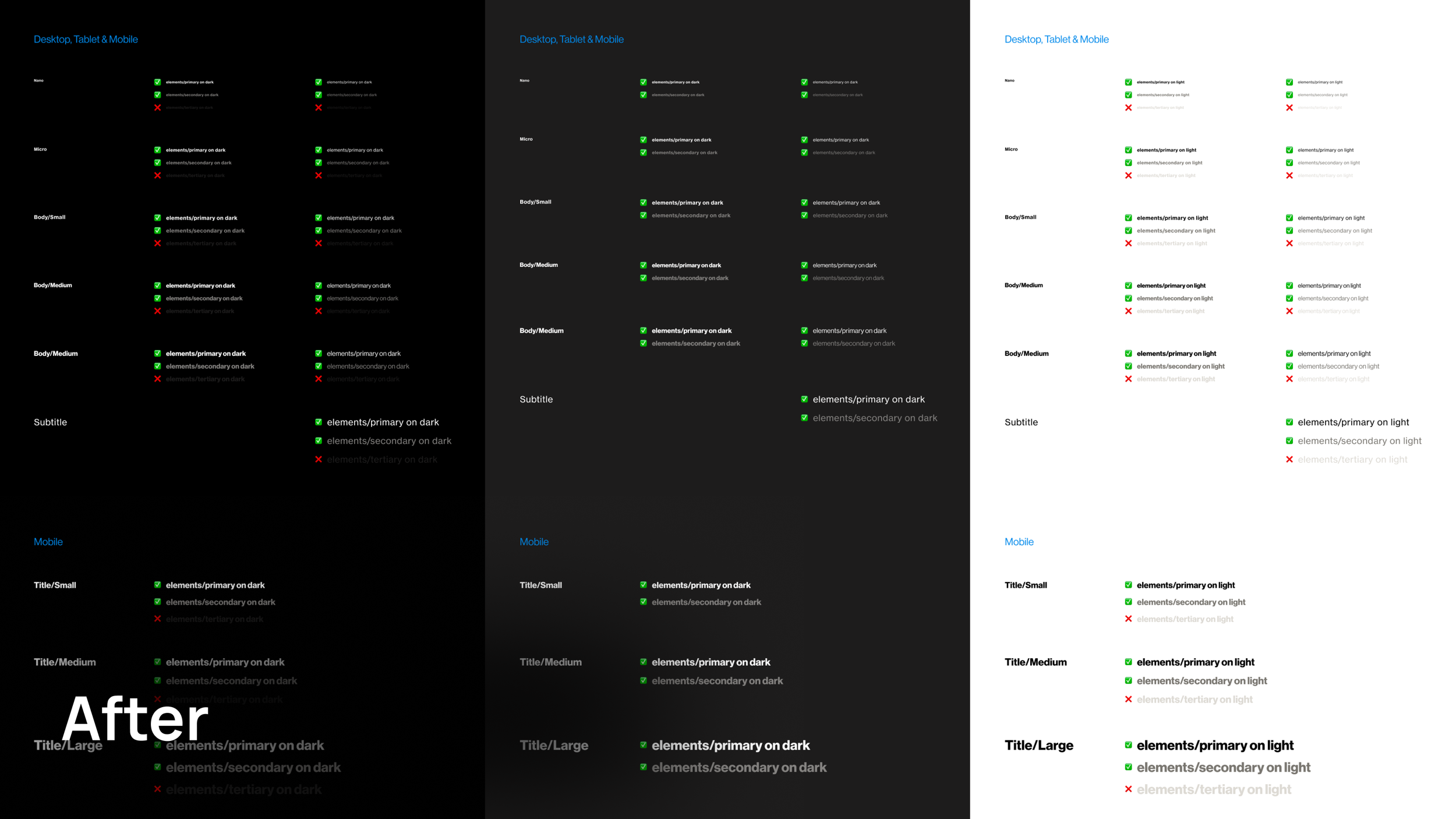
We needed to do accessibility checks with all of our new colors and check type sizes against surfaces.
I created a Accessibility sheet which mapped out all our surface colors with all out type style layered on top.
Accessibility checks
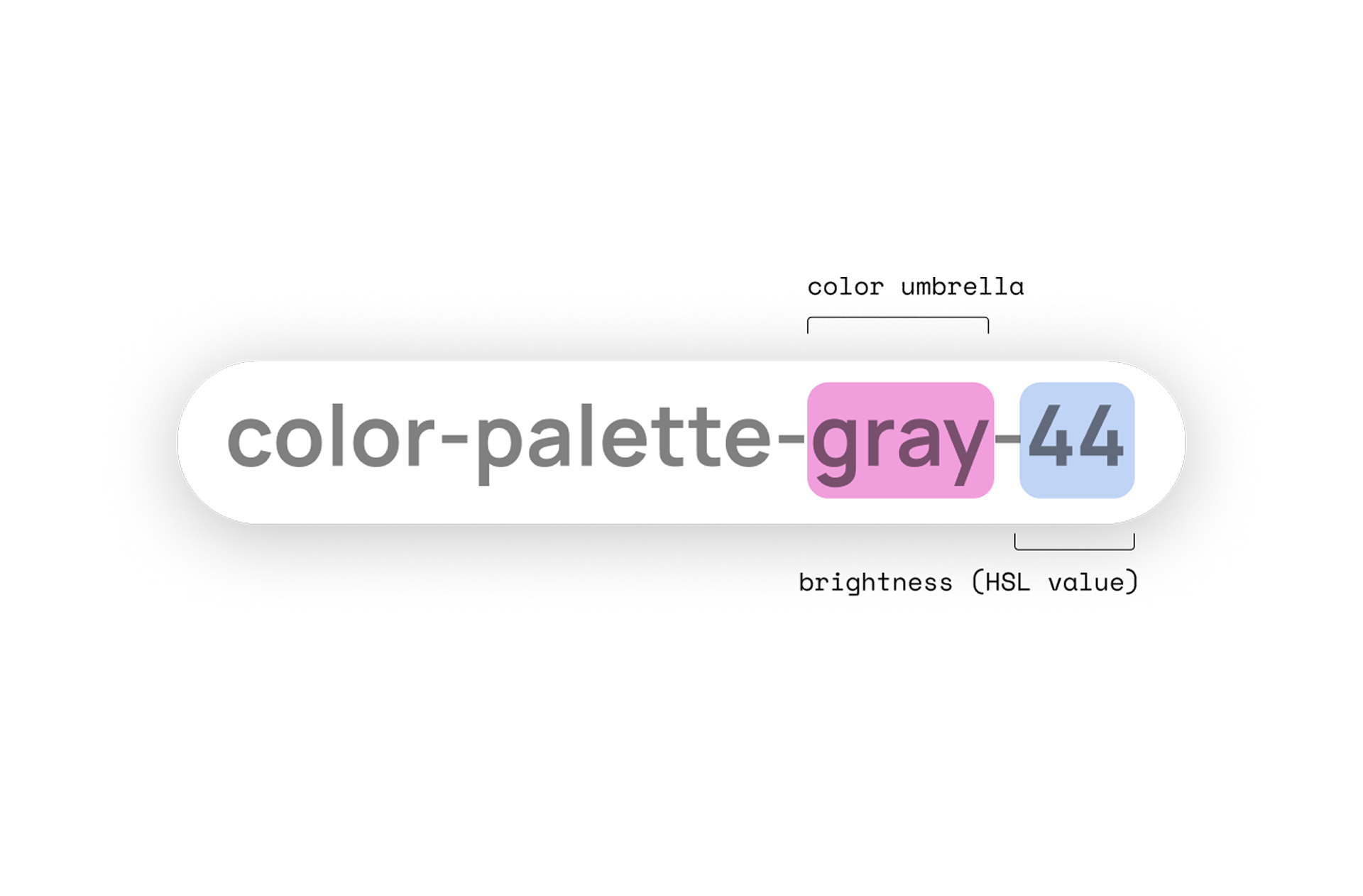
We started off by creating all our primitives - these were the raw values for every single color we used across out products.
Setting up colours
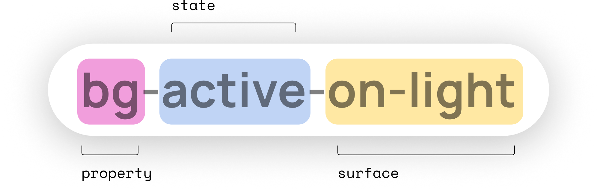
We discussed this update with developers across all platforms and confirmed that this naming structure worked, We advised to stick to lowercase and avoid any special characters or slashes.
The structure of starting of with the property first (background, border, icon) aligned the best code.
Aligning with developers
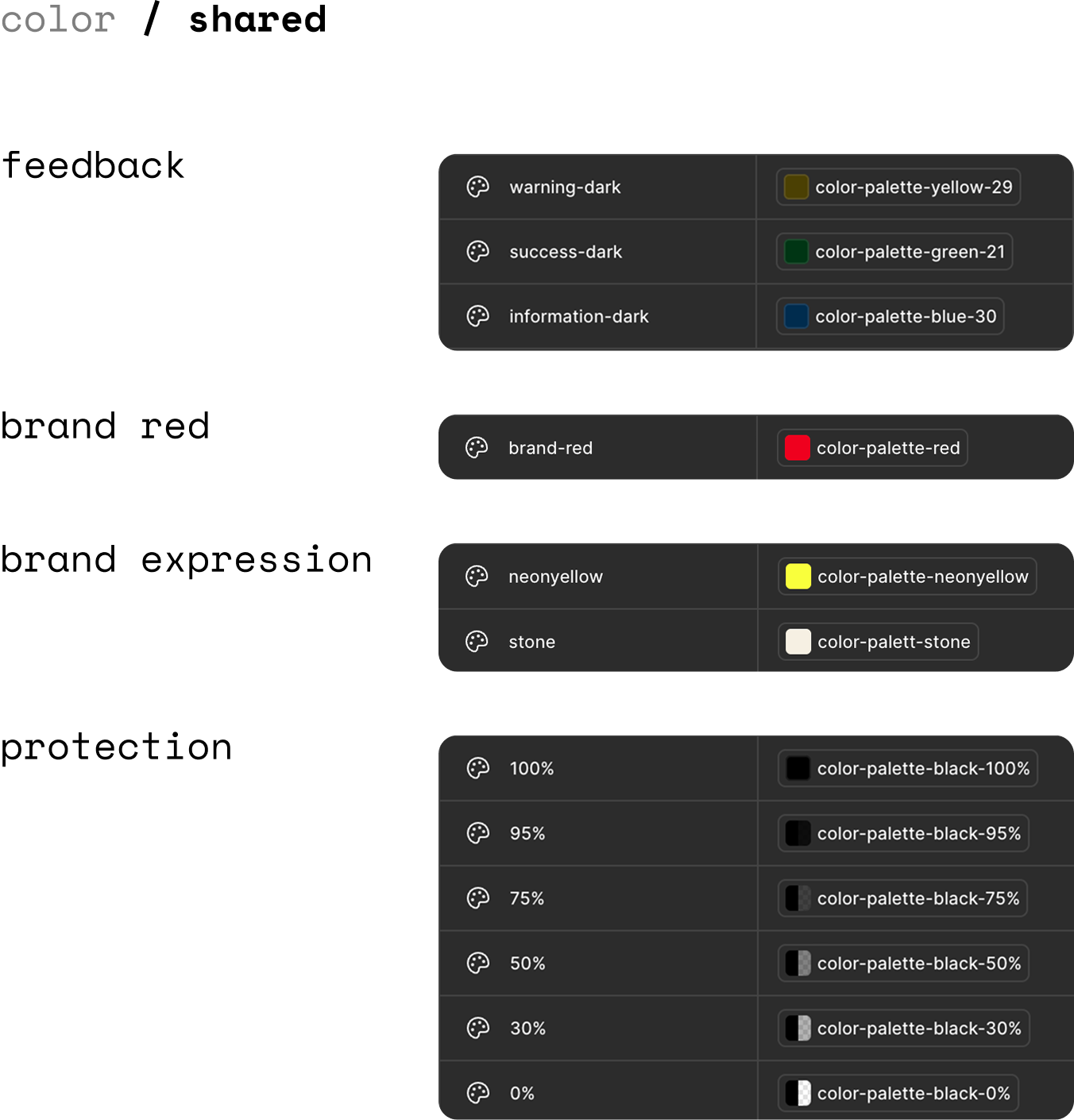
Once we had all out primatives in we added in some shared collections.
These included radius values and shared color groupings like protections/opacity, feedback colors, accent red and brand expression colors.
Collections
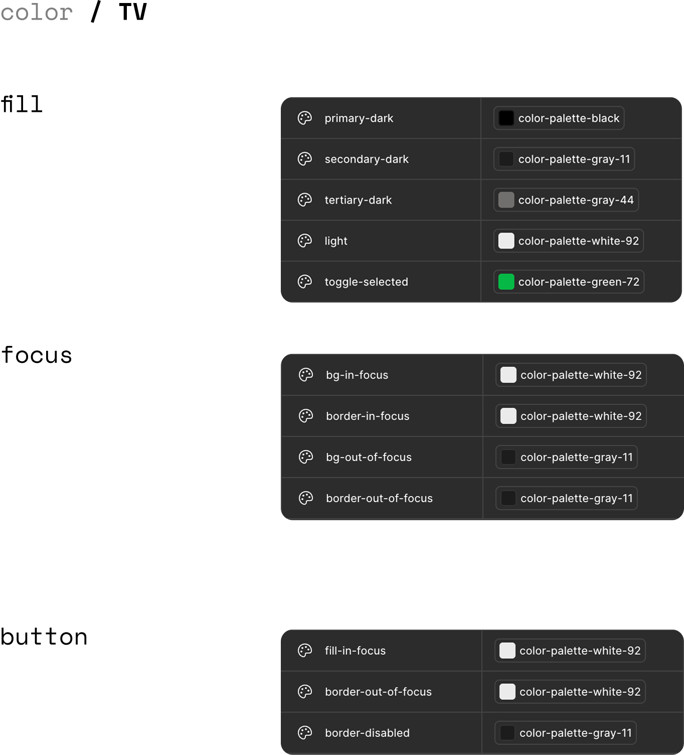
TV colors were slightly different to Web & App because of the different accessibility needs.
We needed 2 platform specific collections with different naming conventions.
Web & App vs TV
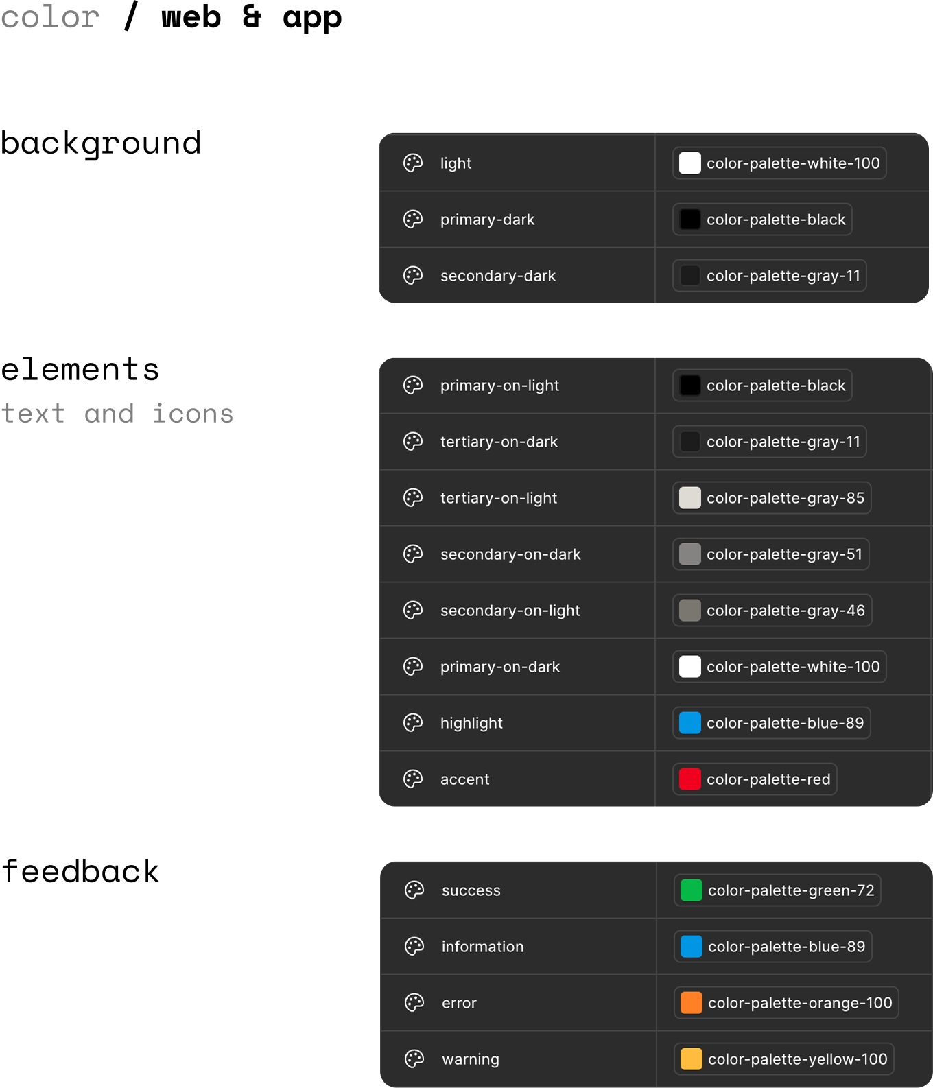
We created sections for background, elements and feedback which could be applied to a wide range of components across web & app.
Web & App
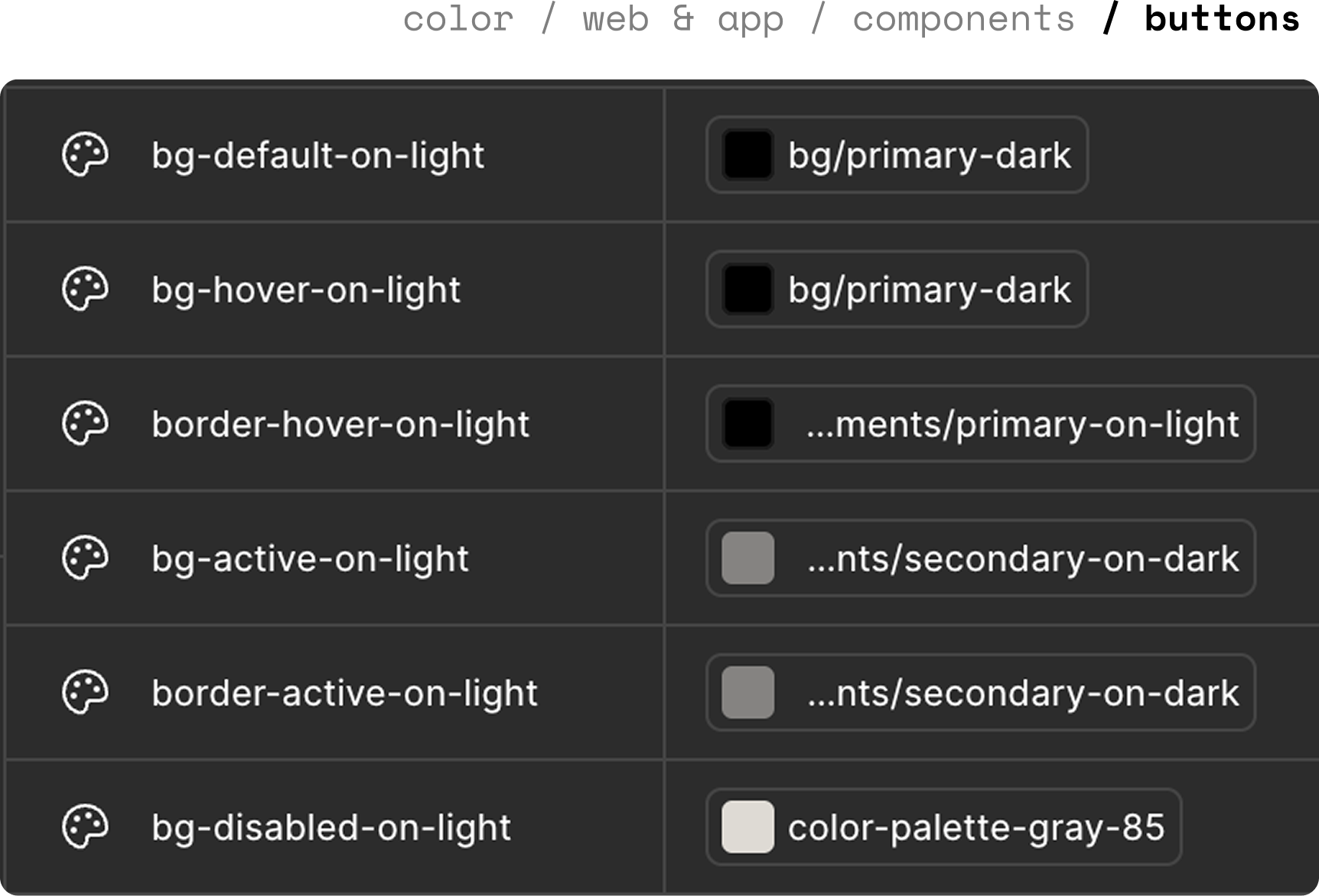
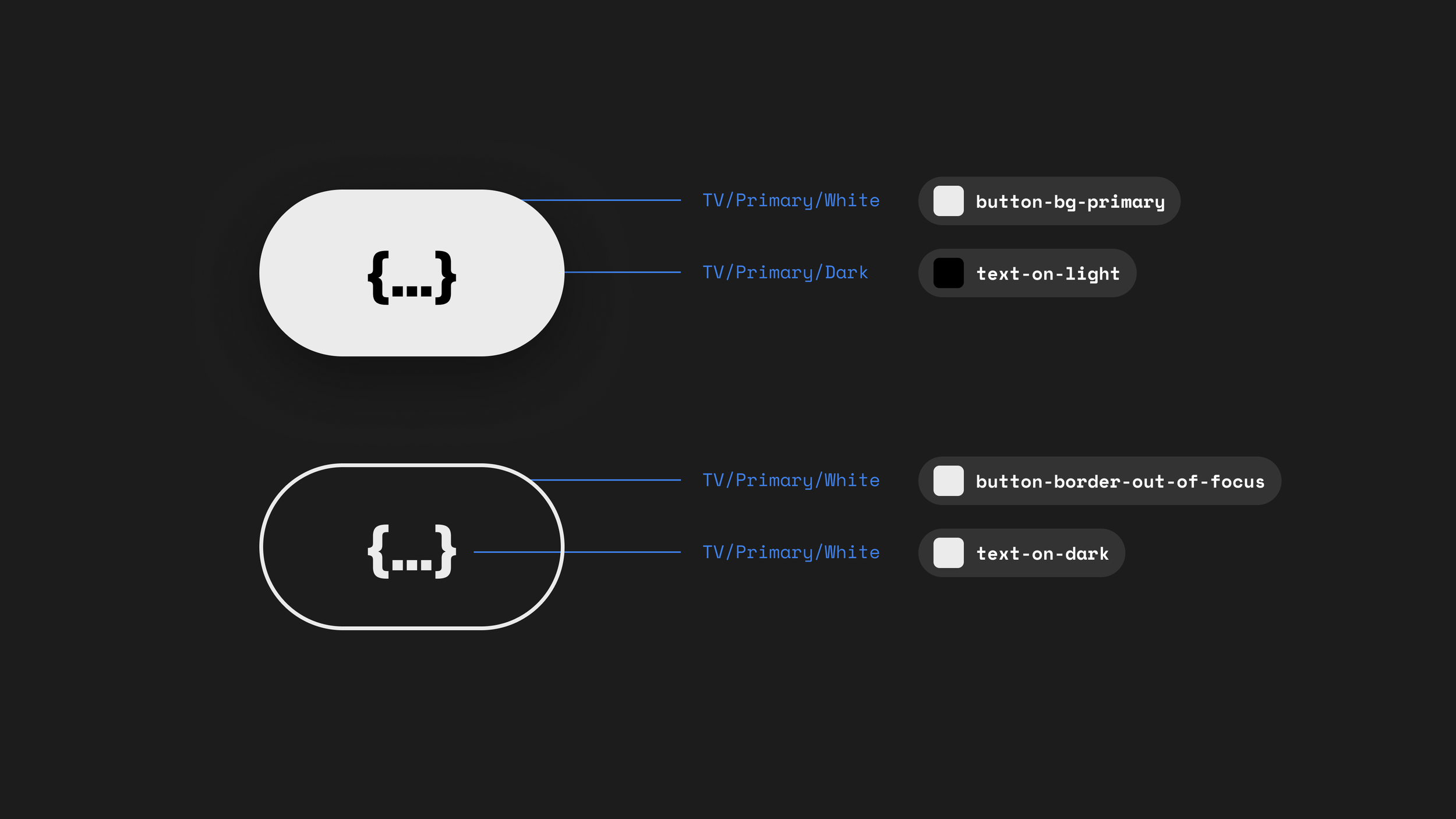
Some components, like buttons needed to have their own group of contextual tokens.
This is because they had different states (default, active, primary...), surfaces (dark and light) and elements (border, fill...).
Other components that have their own collections:
Content cards
Checkboxes, radios
Toggles
Input fields
Components
TV tokens were grouped differently, for example for TV you don’t have hover states, you have focus states. This means TV has no need for specific component groups, fill, text and icon colors are consistent everywhere to help clarity with navigation.
TV
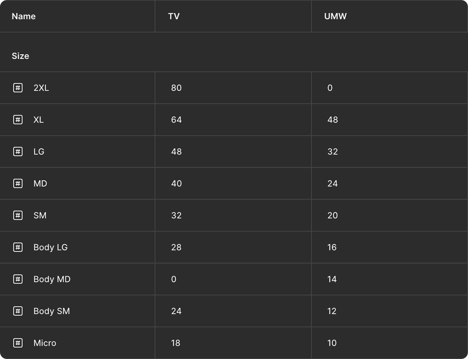
We set up 2 modes for type styles so it was easy to switch entire pages to either TV type styles or Web & App type styles.
This meant we could still retain our naming conventions like body, title and micro and set different values depending on which platform you were designing for.
Type
We created branches of the TV and Web & App libraries and began replacing all styles with tokens.
We then published these changes and ensured each design file accepted the updates.
Pushing changes

Variable tokens have been useful in communicating to the developers what value are need to specific elements in a way that speed up hand off and development. It mad the process smoother as the variables reflect whats in code.
It has also helped us adopt Android TV 14 as this bridge between design and dev was already built.