CVS
Improving the patient portal
Iconography & Design System across mobile & desktop
The challenge
We were tasked with creating a future vision pitch for the CVS employee-facing system. This system allows employees to sign in to patient records, view patient profiles, order and track medication and complete various tasks. We needed to re-design these existing experiences as well as apply the new CVS brand. Another huge part of the task was that the new designs needed to retain the already learned behaviours of employees such as using only keyboard shortcuts rather than a mouse and cursor.
Healthcare is a huge industry in the US where accuracy and attention to detail is essential. The user experience we designed would need to be simple and fast enough to use to be able to get the right medication to the right patients.
Constraints
As we were working with a foundation of the existing system, we needed to get to grips with all the various features. Patient records, patients messages, and ordering medication were a few of the many features we would need to redesign. As we weren’t able to use the system ourselves, we relied on video walkthroughs and photos to carry out an audit and map out all the core functions the employees would need to perform.
Another key aspect we needed to consider was that in the existing system, employees were only using keyboard shortcuts for actions. Therefore keyboard shortcuts were visible next to tasks in the interface.
Shaping the brand
The new CVS brand had not been implemented into the system yet, so along with a overall of the UI we needed to apply brand styles colours and typography.
I started to build out these foundation elements in Figma, creating styles and a foundational design system. The colours in the branding doc had not been assigned to any usage guidelines for digital application yet. I pulled the colours and created a mini colour system for elements such as feedback, buttons and elements.
Components
As this was a pitch, we were working under a short timeframe and a lot of the UI components were built as we worked.
Although this isn’t the ideal way to create a design system, it was an exciting challenge in trying to build components as we needed them and also think ahead.
As other members of the team started to put together screens and dashboards, i worked with them simultaneously to create the components they would need and help with styling and brand compliance.
Iconography
We weren’t provided with any icons from the brand team but had an idea of the vision for their iconography style from various promotional mockups in their guidelines. I was tasked with creates icons to not only visualise each of the 8 navigational points, but also for other elements like our chatbot, delivery, training, notification and more.
I ended up creating 47 custom icons for the system using various styling ideas from the brand guidelines.
Navigation & shorcuts
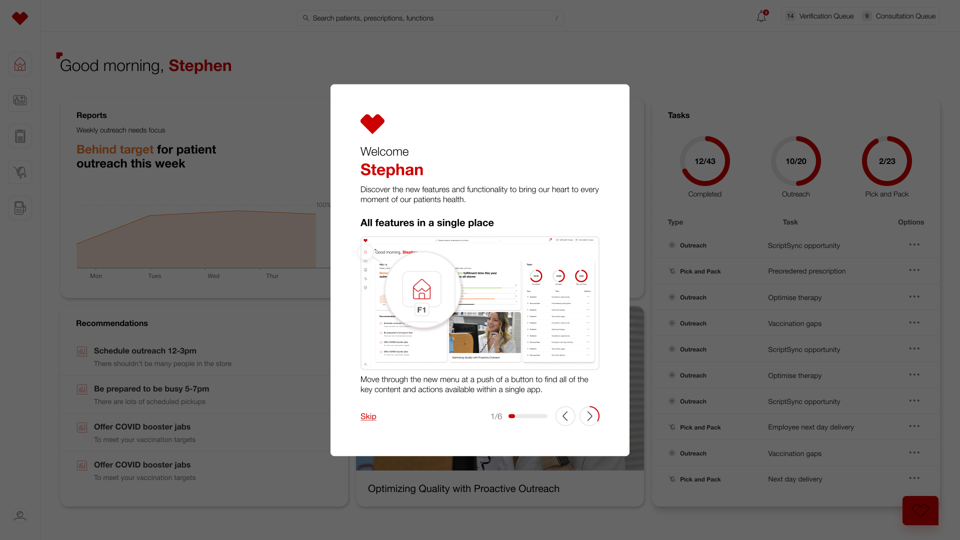
Using the icons, I designed a side bar navigation that highlights key experiences in the system and created variants with and without visible keyboard shortcuts.
This was important as employees were already used to this way of working and in such an integral part of patient management, we needed to cater for this.
Main features
From our audit we outlined 8 main sections included the current system that we could use in our core navigation and dashboard.
Product model
We then decided on the best product model to go forward with. We had four main ideas to consider, a bento box style with various core actions stored in a menu, an OS style model with core ‘apps’, a tree map tile style dashboard with various data visualisation and entry points, or a classic dashboard.
We opted to use the navigations style of the classic dashboard as this fit the best with the main sections we outlined. But we also though incorporating the tree map style for data would work well.
The end result
We ended up with a fresh clean, new look for the system. Showing off features such as quick sign in, search, patient records and task tracking while still keeping the ease and familiarity that employees are used to.


