
Fios TV
Improving browsing efficiency with user curated search.
Iconography & Design System across mobile & desktop
In developement - Limited information has been shared
Overview
The client wanted to push forward a concept around a new feature to help browsing efficiency. The purpose of this features was to allow users a secondary browse experience that would help them find something to watch more efficiently. It had been in exploration stages before, but had been on hold due to not being in scope.
I was tasked with starting from scratch for our hero TV product, Fios TV. I needed to look though the existing user research done on initial designs, existing experiences or anything similar in the industry today and then turn that into user stories and use cases.
Problem
Verizon users find that having too many options when browsing can be overwhelming.
The monotony of scrolling and not finding anything of interest is also frustrating
Personalization isn’t enough and users need a way to find content when there’s a lot of it.
Objective
Develop a feature to aid users in the content discovery process that provides a faster and more efficient result than casual browsing.
Reasearch
To start, we wanted to analyse the past concept and research findings to find out what users initially thought about the features. It was well received, but with lots of areas to improve and questions to be answered.
I and another mod weight designer began to gather fresh research, looking at competitor experience that offered the same solution. We expanded our research into other industries, not just streaming.
Key takeaways
These experiences would generally consider asking a few questions to the user in order to give good recommendations. This would include asking the user about genre preferences, type of content and ratings.
Even though a few companies have tried a few different methods, most of these examples are not existent today, therefore there is an opportunity to provide a solution to decision fatigue that can serve as a competitive differentiator.
What can we takeaway from existing testing? What do users want?
We had existing user feedback to work from. This gave us valuble insight into what users thought of the feature and what they needed from it:
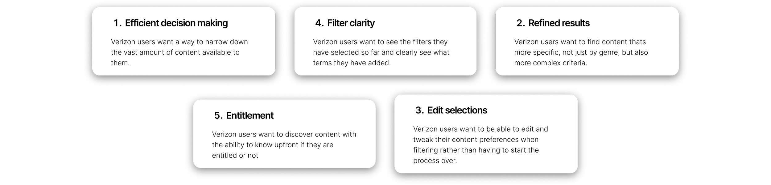
User want to be able to narrow down and refine content with more complex filters.
They want an experience that helps initiate further searches.
The need visibility of filters they have applied to clearly visualize their entire search.
They need flexibility to tweak and edit their filter terms.
They need to see a refined set of results at the end of their search that is easy to digest.
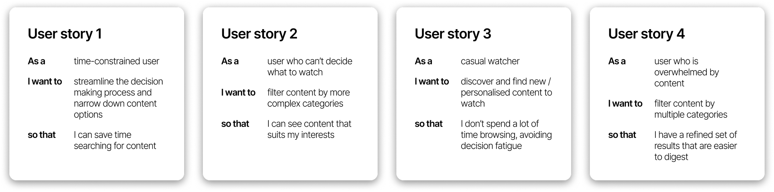
User stories and goals
Next up: Create some concepts
Now that we had some feedback from the client about what they wanted, which competitior experiences they like and isn’t like, we c oul start creating some concepts so they were able to get an idea of how the feature could work in our product
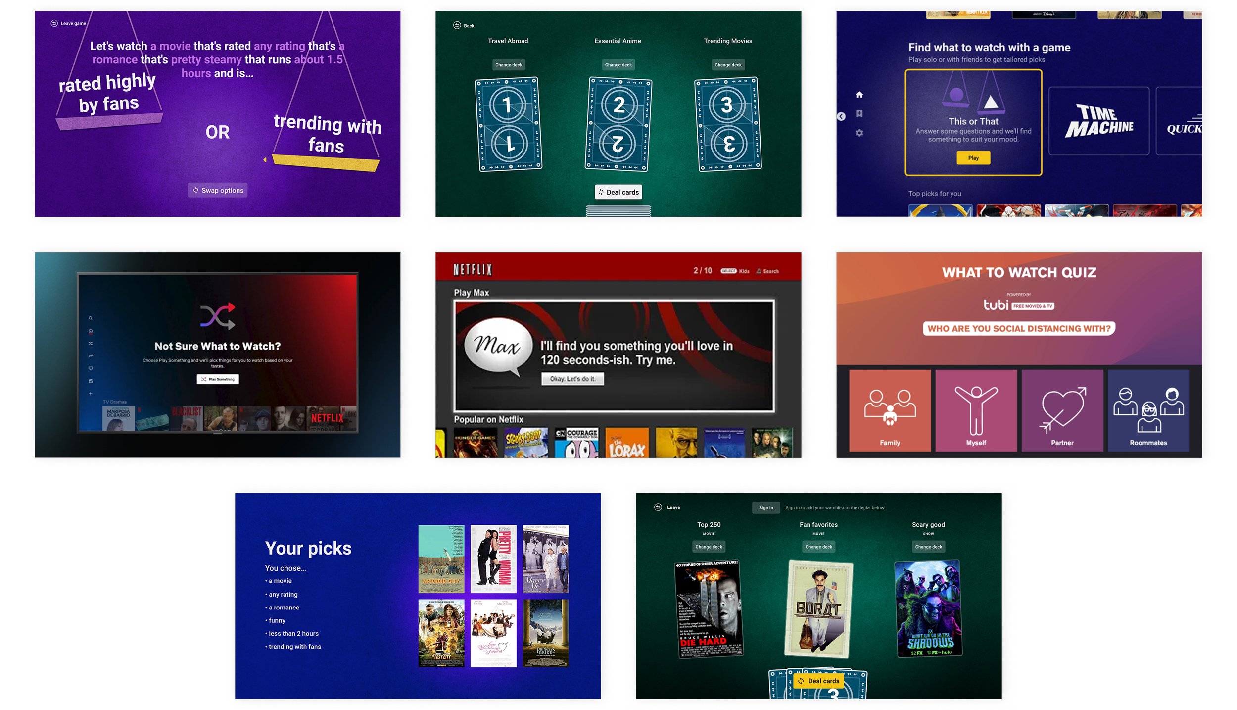
Concept 1
Let users build a sentence from a fixed set of categories which would act as the ‘search’ to generate results.
Concept 2
The user chooses a combination of tags that fit their most important filtering criteria. The user can then keep choosing criteria until they are happy with their results.
Concept 3
The user choose from a set of to filters and keep building until they reach their desired set of results. We made this visually fun and gamified.
Feedback & next steps
We received lots of feedback of two separate hour-long calls where we discussed all three concepts in depth. The client loved the compound structure of concept 1, the gamified approach with concept 2 and the visual of concept 3.
After some further deliberation in internal calls, the client said they wanted to see further exploration around a gamified experience - something fun and visually interesting and further exploration into a compound statement structure, where they user could build a ‘search’.
Concept 1
Gamified experience
We experimented with different visuals for a gamified experience that felt like you were playing a game. The client enjoyed this concept but felt it lacked a premium feel.
Concept 2
Compound statement
The user builds a query that has a combination of different tags like genre, setting, release year. These can be shuffled to generate new parameters based on the users interests.
The client loved the concept of building a statement, but it lacked the excitement's and visual interest that concept 1 had.
Finalised design
The final structure mixed together everything the cleint liked - something visually interesting and premium, but also functionally clean and easy to use.
We had months of cleint and developer/tech calls to finalise the user flows and main use cases. We had to e ure that the backend mechanism could handle lots of filters and edits, as well as refine the UI so that users could see their filtered results in a clear, concise way.
User testing & feedback
We had finally got to a point where we had a solid feature design and we ready to test with real users. I created the prototype in Figma from scratch. It allowed testers to use the feature as if it was live in the product. They were able to generate results, filter and test out all the functionality we wanted to build.
Participants used the word “Exciting” to describe the feature and appreciated it as something new and different from how they currently browse.
They reacted unprompted and positively to the different features and functions and felt the experience was intuitive enough to know how to navigate and use.
Hand off
We worked through user feedback, refined the design and had another wound of testing which went even better. We received great feedback with minimal change needed and soon after the designs were handed off for development!
Working with a TV product, all interactions are actioned through a remote, therefore i built a thorough matrix showing each button interacting within the product. Back button logic needed to be defined so the back stack (when users press back on a remote) made sense. This was extremely helpful to the developers as they knew exactly which buttons to match to the experience.
Further implementations
The client decided it was then time to implement this feature for other platforms. I was the sole designer for translating the feature over to the mobile and tablet app experiences which was an interesting challenge! Moving from TV screen designs to a touch device called for slightly different, and more flexible interactions. We could make the hand help device experience a little more free flowing and flexible as you aren’t confined to remote buttons.
I worked to ensure that the experience felt and visually looked the same so that the feature aligned across all platforms. These designs are also now currently in development.
I’m very proud of this feature. The client are super excited to be the first streaming platform to have a complex feature like this. I was lucky enough to be the lead designer for it from start to end and its been a real labor of love. I can’t waiting for Verizon customers to be able to use it and am confident it will increase retention, engagment and moments of delight.